Paul Bonnici and family

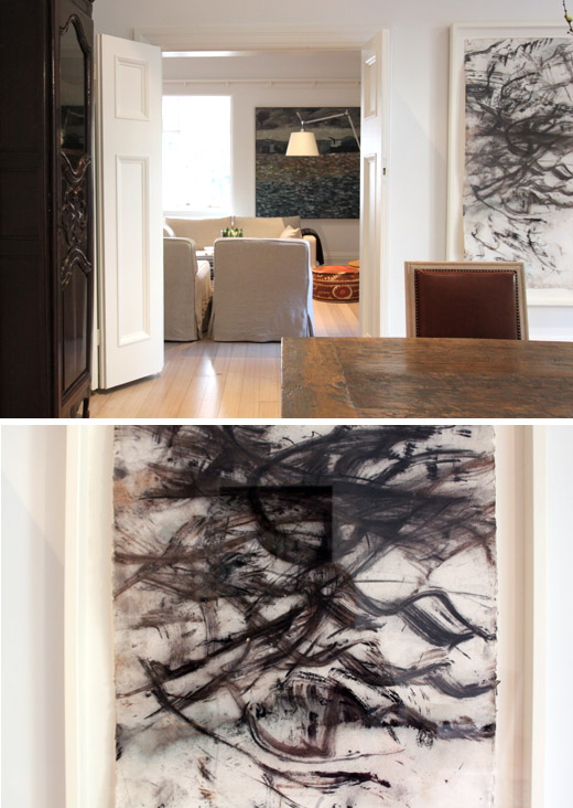
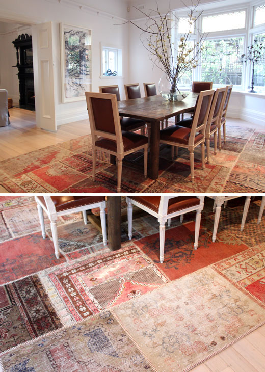
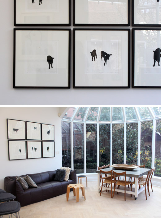
The South Yarra home of Paul Bonnici and family. Above image – the dining room, looking into living room. Artwork – Whip to Forest by John Wolseley.
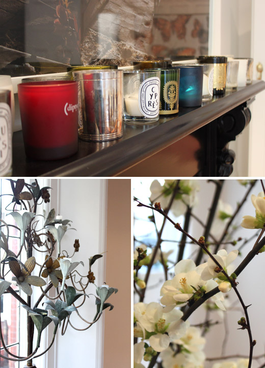
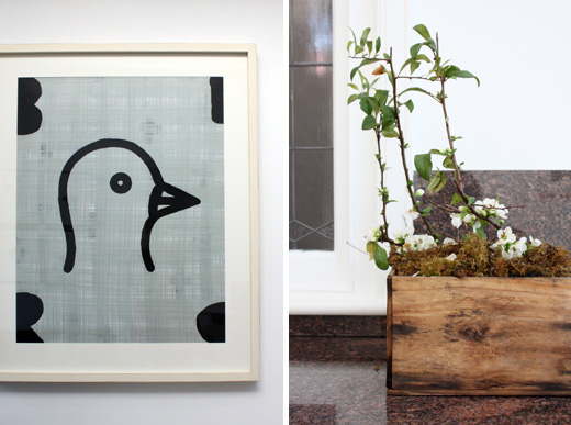
Dining room details – an impressive collection of beautiful candles, cherry blossom on the dining table.
Dining room – patchwork rug by Loom Rugs of course!
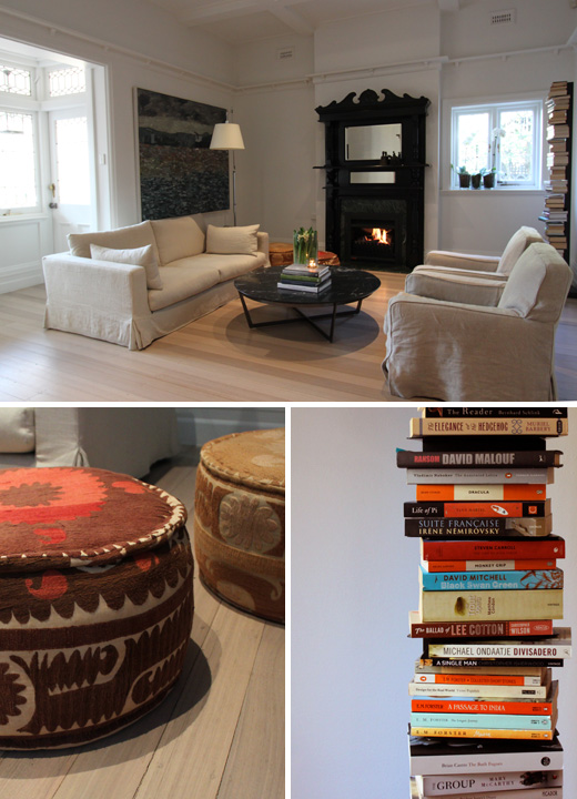
Living Room – beautiful open fire…!
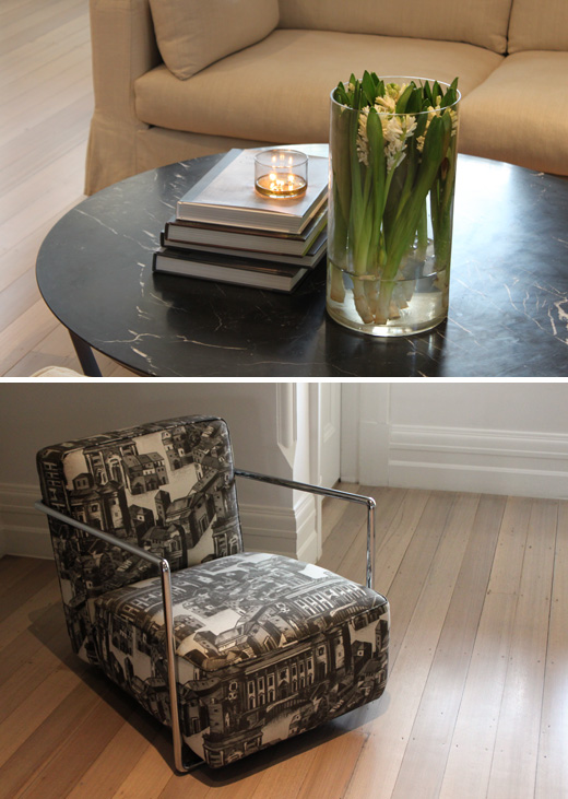
Living room details… love that beautiful stone coffee table.
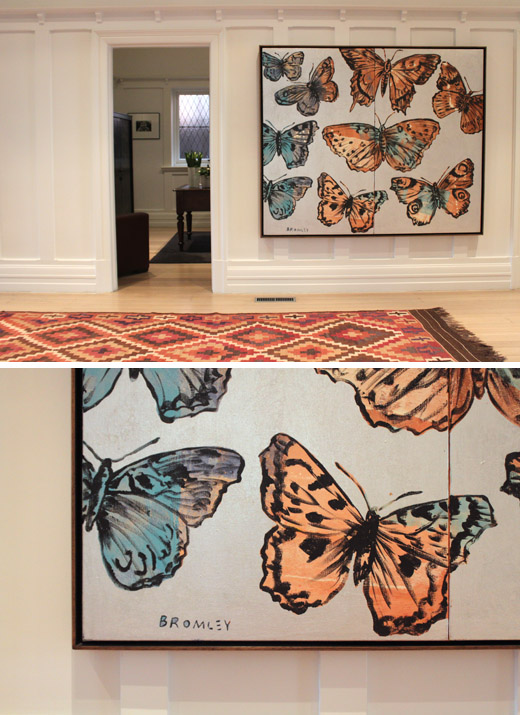
Ooooh it’s a little more David Bromley! Butterflies. SO beautiful in the main hallway. And another Loom Rug.
Oooh la la… in case you didn’t notice, today’s Melbourne Home is a little bit posh :) This is the South Yarra home of Paul and Wendy Bonnici, and their kids Ben (8) and Toby (2). Isn’t it GORGEOUS!?
Paul emailed me a little while ago with a short but sweet little note which went a bit like this –
Hi Lucy, LOVE THE Design Files… I would like to offer my home for you to look at…
Would love to chat sometime,
Cheers Paul.
Of course I am always excited when a boy is reading (a very valued 9% of my readership, ahem), and I must say I did also appreciate the CAPS and general enthusiasm of Paul’s email! Paul is a well established and highly respected local creative brain – he’s the ex-marketing and creative director of Myer, and in 2009 went out on his own, launching retail creative strategy consultancy Create & Communicate 2c.
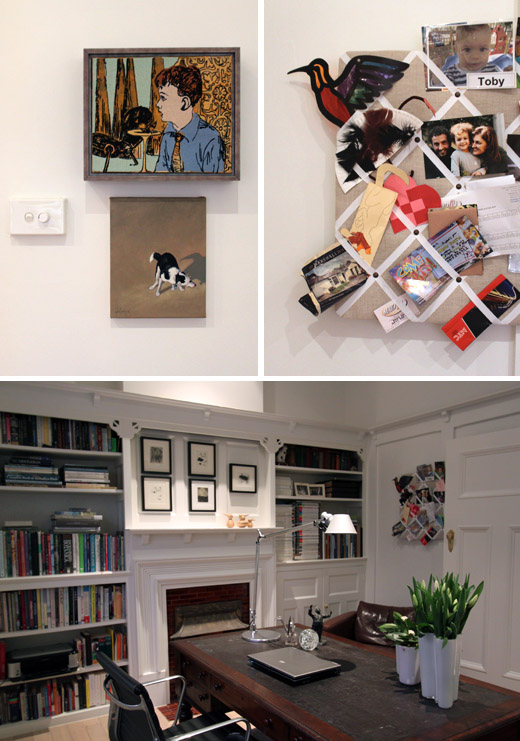
SO of course a few weeks after our initial emails I found myself dashing about Paul’s beautiful home, photographing every angle (and there was a lot to cover!). When I met Paul I was kind of expecting a ‘suit’ who would have to dash off to work within minutes of our meeting, but instead he was so casual, super friendly, and said he hasn’t worn a suit for about 2 years since leaving Myer! He was more than happy to let me run around his pristine home with my camera whilst he worked away in his office… ahhh it was quite blissful. Because whilst I really and truly love meeting new people every time I photograph a gorgeous Melbourne Home, I do sometimes struggle to hold a conversation and take half decent pictures at the same time! – Thanks for being low-maintenance Paul!
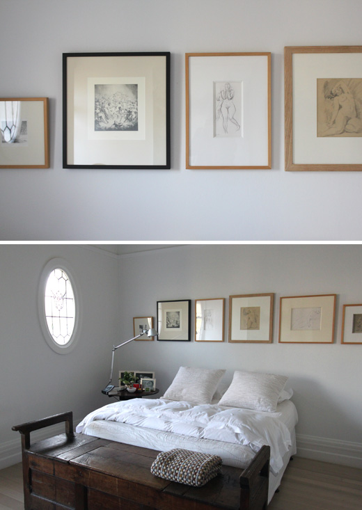
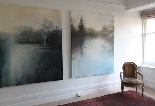
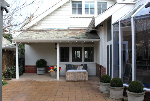
Paul, Wendy and their kids have lived here for 2 years now, after moving from a smaller home in the same area. They’ve made a number of cosmetic changes to the interior – painted the walls white, re-done the beautiful pale timber floors, and added beautiful soft lighting throughout. Paul says ‘it was all about de cluttering the house – its got great architectural features and a lot was not seen due to the heavy decoration. It was about removing layers that had been added over the years.’ The result is a beautiful, generous family home, simple and unfussy in it’s style. The overall look is classic but restrained – and full of lovely details such as the Loom Rugs and that stunning Butterflies painting by David Bromley in the hallway! Swoon!
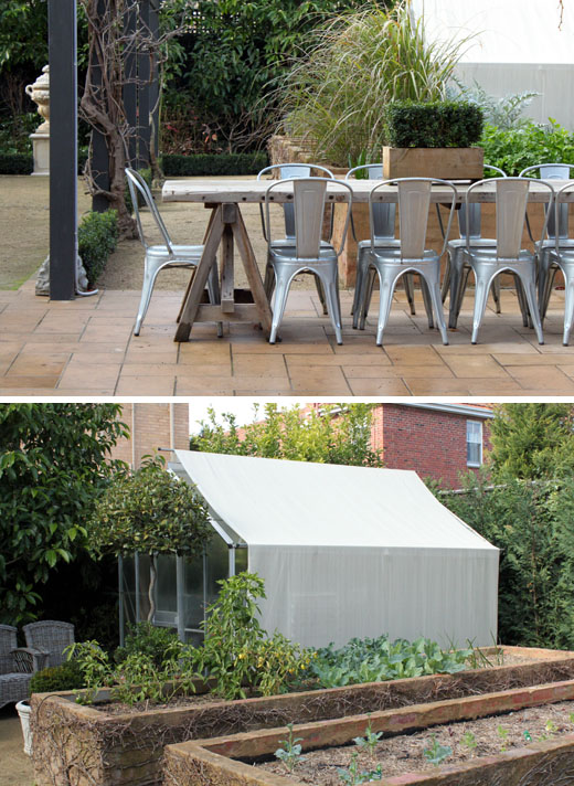
One of Paul’s favourite features of the home is the garden. When they moved in the garden was ‘very cottage style not quite us’ says Paul – he now describes it as ‘unstructured structure!!’. I love the raised garden beds with lots of vegies growing, and the beautiful outdoor seating area with that chunky rustic timber tables and those fab Tolix chairs!
HUGE thanks to Paul and his family for sharing their very special home!

